Discover the 10 crucial elements every high-converting landing page needs. I’ll show you how to boost conversions and turn visitors into customers with these essential tips.


In today’s fast-paced digital world, making a landing page that converts well is key. As an Aussie business owner, I’ve learned how vital it is to make your online presence stand out. But what makes some landing pages work better than others?
This article will look at the 10 key elements that turn a basic landing page into a top performer. By adding these elements, you can make a page that grabs your audience’s attention and gets them to act.
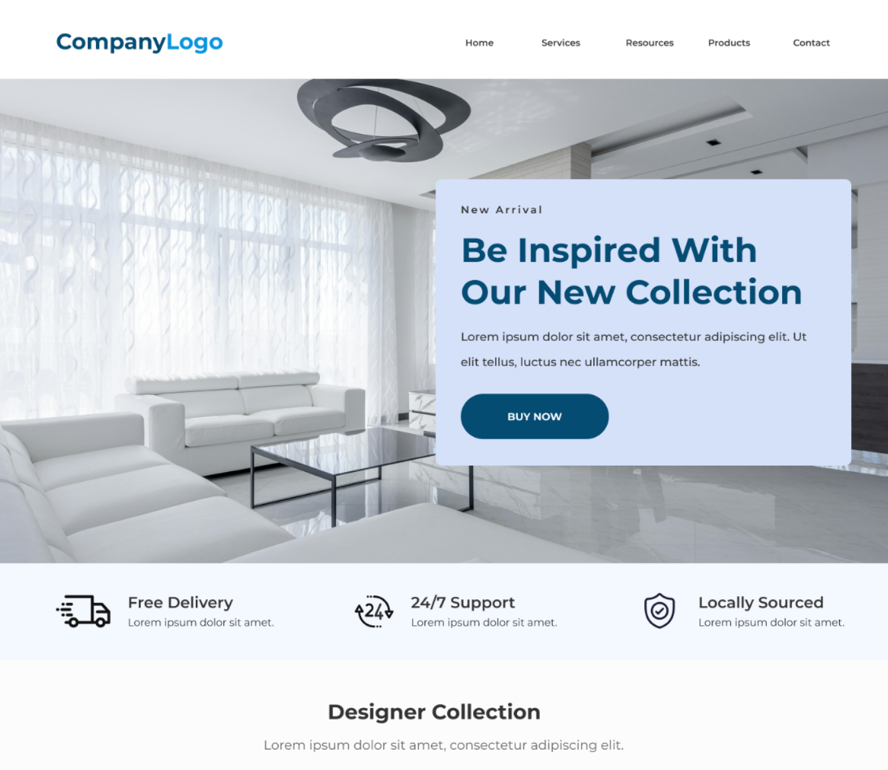
Your headline is the first thing people see when they visit your page. It’s crucial to be clear, concise, and captivating. Use power words, emotional triggers, and a strong value proposition to draw in your audience.
Creating a headline that connects is tough but rewarding. A focused, benefit-driven headline can increase conversion rates by up to 95%. This can significantly boost your landing page’s success.
Great headlines don’t just catch attention; they show they understand your audience’s problems and dreams. By offering solutions directly to their challenges, you make your content more relevant and engaging.
For instance, “Conquer the Pandemic with our Tailored Support” is more impactful than a generic headline. It connects with customers on an emotional level, potentially increasing conversions by 190%.
Creating the perfect headline is an ongoing process. Try different styles like “how-to” formulas, numerical claims, and action-oriented directives to see what works best. A 40% increase in conversions can happen when focusing on positive benefits rather than negative tones or questions.
Your headline is the first step to engaging with your visitors. Make it impactful by addressing their needs, showcasing your unique value, and setting the stage for a compelling experience.
“The headline is the most important element of any landing page. It’s your chance to grab the visitor’s attention and convince them to keep reading.”
As a seasoned copywriting journalist, I know how crucial subheadings are for a great landing page. They’re not just for looks; they’re key storytelling pieces that guide readers and keep them hooked.
Good subheadings should be clear, detailed, and packed with the right keywords for SEO. They must also tell your offer’s story, showing off what makes it special and encouraging people to explore more.
Studies show that clear headlines grab potential customers’ attention on landing pages. Subheadings then back up these headlines, making the text easier to read.
When making your subheadings, think about who your audience is, what your page aims to do, your brand’s voice, and the keywords you’re targeting. Testing different subheadings can also show you what works best with your audience.
Using these tips, you can make a landing page with subheadings that improve user experience and boost conversions. Remember, the right subheadings unlock the power of subheadings, readability, storytelling, and SEO for a top-performing landing page.
Choosing the right visual elements for your landing page can greatly affect how engaging it is and how many conversions you get. Images and videos can catch your audience’s eye, stir feelings, and quickly show the value of what you’re offering. These elements are key to making your page stand out and persuade visitors.
Now, a lot of web traffic comes from mobile devices, so having a page that works well on all devices is crucial. Using A/B testing and optimisation can also help boost your page’s conversion rate.
Platforms like Strikingly offer many templates aimed at boosting conversion rates. They let you match your brand and audience with your page’s look. Adding top-notch visuals can make your page more impactful and memorable, leading to more conversions for your business.
| Brand | Visual Elements | Impact |
|---|---|---|
| Nike | High-quality images of their products in action | Captures attention and showcases the products’ capabilities |
| Apple | Minimalist approach with a focus on simplicity | Emphasises the product’s design and user experience |
| Airbnb | Engaging call to action with compelling visuals | Encourages visitors to take immediate action |
By focusing on visual elements, images, and videos, you can boost engagement and conversion rates. This makes your offer more memorable to your audience.
In today’s fast-paced digital world, clarity is key for landing page copy. Your content should be clear and concise. It should clearly show the benefits of what you’re offering. This balance of info and persuasion helps visitors make a choice.
Studies show that landing pages with videos can boost conversions by up to 86% compared to those without. Also, top-performing landing pages don’t have menus, social links, or other distractions. This helps keep visitors focused on what you’re offering.
Copywriting formulas like AIDA (Attention, Interest, Desire, Action), PAS (Problem, Agitate, Solution), and BAB (Before, After, Bridge) can really boost your landing page’s success. Using emotional language and tapping into what customers want can also make a big difference.
“Focusing on only one offer, promise, customer avatar, and goal on a landing page is crucial for effective conversion.”
Adding social proof like customer reviews, social media followers, and past sales can build trust. Also, having 10 to 15 landing pages can lead to up to 55% more leads. This shows how important a strong landing page strategy is.
The secret to great landing page copy is to keep it simple, focused, and engaging. By focusing on clarity, conciseness, and persuasion, you can make a landing page that grabs your audience’s attention and gets results.
The call-to-action (CTA) is the final step that makes visitors take action. It’s key to making a strong CTA that grabs attention, shows value, and pushes users to convert. This is crucial for getting those important conversions.
First, make your CTA button stand out. Use colours and designs that pop. Place it where it catches the eye and leads the user to act.
The words on your CTA matter a lot too. Choose strong words that make people feel they’re getting a good deal and that they should act fast. Keep it simple and clear, so users know exactly what to do.
The CTA is the peak of your landing page. It’s where everything you’ve worked on comes together to turn visitors into customers. With great design and words, you can make a CTA that really speaks to people and boosts conversions.
“A good call to action can help with decision fatigue and give meaning to content, thereby encouraging potential customers to stay engaged on the site and leading to increased conversions.”
To make your CTA work best, try these tips:
With these tips, you can create a call-to-action that grabs your audience’s attention and leads them to conversion.
Building trust is key for getting people to convert. Adding things like customer testimonials, reviews, and trust signals can really help your landing page. These elements make your page more real and convince visitors they’re making a good choice with your brand.
Using social proof is a strong way to show your product or service’s worth. Show testimonials from happy customers to share their good experiences and the benefits they’ve seen. Reviews can also be trust signals, making your offer seem more credible.
Other trust signals can also make your landing page more credible. This includes showing trust badges, security seals, or industry affiliations. These show your brand is real and cares about customer satisfaction.
| Metric | Average | Top Performers |
|---|---|---|
| Landing Page Conversion Rate | 5.89% | 11.45% or higher |
| E-commerce Landing Page Conversion Rate | 12.9% | 46.85% (Twillory) |
| SaaS Landing Page Conversion Rate | 9.5% | 17.72% (Evolo) |
| Webinar Landing Page Conversion Rate | 22.84% | N/A |
By adding these credibility boosters, you can make your landing page more convincing. This leads to more conversions and a stronger bond with your audience.

“Clarity on landing pages led to substantial improvements in conversion rates, with examples like clarifying a product as a supplement that resulted in an 89% increase in sales.”
If your landing page needs visitors to fill out a form, make it short and easy. Long or complex forms can scare people off. So, keep them simple and only ask for the must-have info.
Our research shows that 27% of form users will leave if the form is too long. This can really hurt your lead generation. To avoid this, make your forms short, simple, and only ask for the most important info.
Remember, conversion rates start to fall off after 7 fields in a form. Try to keep your forms to 4-7 fields. This includes the name, email, and any other key details you need.
Also, think about adding radio buttons and making your forms mobile-friendly. This makes it easier for users to fill out the form. By making your forms easy to use, you can increase your conversion rates and get better leads.
The secret to great form optimization is using data. Keep testing and improving your forms with different layouts and questions. This helps you find the best way to get leads without annoying your users.
By focusing on optimizing your forms, you can make getting leads easier and improve the user experience. This leads to more conversions for your business.
Nowadays, most people use their phones to look at websites. So, making sure your landing page works well on mobile is very important. A design that changes size for different screens makes things easier for users and can increase the number of people who take action.
Studies show that mobile-friendly landing pages get 74% more conversions than those that aren’t. Also, 60% of people will leave a site if it’s hard to use on their phone. This shows how key it is to make your site work well on mobile.
Pages that work well on mobile give a better experience and bring in 2.5 times more leads than those that don’t. And, 57% of users won’t suggest a business if its mobile site is bad. This shows how important being mobile-friendly is for trust and brand image.
| Metric | Impact of Mobile Responsiveness |
|---|---|
| Conversion Rate | 74% increase |
| Likelihood to Abandon | 60% more likely to leave |
| Lead Generation | 2.5 times more leads |
| Recommendation | 57% won’t recommend a non-mobile-friendly business |
When making mobile-friendly landing pages, keep it simple with a single-column layout and focus on one thing at a time. Use sticky bars and click-to-call buttons to make it easier for mobile users and get more conversions.
By making your landing page work well on mobile, you can reach more people, make their experience better, and increase your conversion rate. In today’s mobile-first world, being adaptable is the secret to doing well.

Making great landing pages is an ongoing task, not just a one-off. It’s key to use A/B testing and keep an eye on how users behave and what they say. This ensures your pages work their best.
A/B testing lets you see which version of your page works best. You can test things like headlines, pictures, words, and calls-to-action. This way, you make choices based on data to get more conversion optimization.
Getting feedback from users through surveys, polls, and heatmaps gives you great insights. This feedback shows how people use your page. You can use this info to make your page better and increase conversions.
Remember, making your landing pages better is a cycle. Stay flexible, test new ideas, and keep improving. With a focus on data and making things better for users, your pages can turn into powerful tools for your business.
“Continuous testing and optimization is the key to unlocking the full potential of your landing pages. By embracing a culture of experimentation, you can continually improve the user experience and maximise your conversion rates.”
A/B testing is a strong tool for making your landing pages better. It lets you see which version of a page does best. You can test things like headlines, pictures, CTAs, or the whole design.
Along with A/B testing, getting feedback from users is key for better landing pages. Use surveys, heatmaps, and session recordings to see how people use your page and find areas to improve.
By using A/B testing and user feedback together, you can keep making your landing pages better. This ensures they always give the best experience and get the most conversions.
Making high-converting landing pages is key for my digital marketing success and business growth. By using the 10 essential elements in this guide, I can make pages that grab my audience’s attention and get great results. It’s important to keep testing, optimising, and adapting to new digital trends to keep my landing pages working well.
By making my landing page’s headlines, visuals, and call-to-action better, I can increase my conversion rates a lot. For example, a company got 63% more conversions with a long-form landing page for their PPC campaign. Highrise saw a 103% increase in conversions with a short-form page.
Adding trust signals and making my forms easier to use can make the user experience better and get more conversions. Also, keeping my pages mobile-friendly and always testing and improving them will help them stay effective. By getting good at these strategies, I can build a strong base for my marketing efforts. This will help my small business grow and succeed.
A high-converting landing page needs a catchy headline, engaging subheadings, and striking visuals. It should have clear copy, a strong call-to-action, and credibility boosters. Forms should be optimized, it must be mobile-friendly, and always test and improve it.
The headline is crucial as it captures the visitor’s attention right away. It should be clear, concise, and highlight what makes your offer special. This helps keep visitors interested and moves them further along in the process.
Good visuals like quality images and videos can really boost engagement and conversions. They catch the eye, stir emotions, and quickly share the value of your offer. This makes your page stand out and persuade visitors more effectively.
The call-to-action (CTA) is key to getting visitors to take action. It should stand out, highlight the benefits and urgency of acting now, and lead users to the desired action. This could be signing up, downloading, or buying.
More people use mobile devices, so having a mobile-friendly landing page is a must. A design that adjusts to different screens ensures a smooth experience on all devices. This helps you reach more people and boost mobile conversions.
Making your landing pages work better is an ongoing task. Use A/B testing to see which versions do best. Always check how users behave, get feedback, and tweak your pages to get better results over time. This will help you get more conversions.